An analysis which explores why pass completion (%) is an inadequate statistic to evaluate a player’s passing ability
Callum Littler - June 2020Abstract
This piece of work is an explanatory piece which focuses on changing perceptions on passing in football and how we evaluate a player’s passing ability. The project combines visualisations built in Tableau with analysis performed in Python. I end by presenting my solution to how passing should be appraised in the future.1.1 Introduction
In February 2020, Manchester City’s Rodri set the Premier League record for the most attempted and completed passes in a single match. Rodri completed 178 out of an attempted 188 passes against West Ham United in their 2-0 win at the Etihad. His performance gained praise from both press and pundits and whilst there is a lot of merit in being able to recycle possession of the ball, when pundits use pass completion or the amount of passes to evaluate a player’s performance, I find it frustrating. This is largely because these metrics do not incorporate the quality of the passes which are being made.In this piece of analysis, I am going to explain the pitfalls of using pass completion (%) to evaluate a player’s passing ability. I will then show my alternative solution - a basic model, but one which incorporates the difficulty of the pass. I will finally conclude with an example of why coaches should be examining pass maps in detail to find nuances in their own players’ or an opponent’s game.
1.2 The Set-up
In order to complete this analysis, I have utilised Statsbomb event data and have selected to use the 2018/19 and 2019/20 seasons from the FA Womens Super League as the data for my model. This data provided me with a sample of 176,049 passes. The data contains (X,Y) pass coordinates for the start and end positions on the field and also the outcome of a pass, i.e. whether the pass was successful or not.The following analysis focuses on three hypothetical player performances. The three players are R. Starr (Right Back), J. Lennon (Centre Back) and P. McCartney (Central Attacking Midfielder). I will analyse each player’s passing performance by looking at their respective pass maps and use them to present my solution and additional findings. I have opted to use these fictional players rather than actual players to remove any preconceived biases. If, for example, I chose to evaluate Kevin De Bruyne’s passing performance in my analysis, the reader would already have the preconception that Kevin De Bruyne is a good passer and this is something I want to avoid.
*Disclaimer: The data for each of the three players mentioned above has been manufactured to provide a narrative to my analysis. The data behind the model built later, however, is based on real match data.
1.3 Data Background
Before any analysis, it is probably best to briefly set the scene about what the data can and can’t tell us. Firstly, when a player passes the ball and it reaches a teammate, this is classified as a completed pass. If the ball is intercepted by the opposition or if the ball goes out of play, this is classified as an incomplete pass. However, if a pass is intercepted, we do not know where the intended destination of the pass was meant to be. The end point for the pass in this case, is where the interception was made.What this data cannot tell us is that extra level of detail e.g. the ‘whose fault was it’ detail. This is the reasoning behind why the pass was incomplete. It might not necessarily be the player who passed the ball but instead, something which the passer was unable to control. This could be through a brilliant defensive interception or perhaps a teammate not being quite on the same wavelength. This does not mean that the pass in question was a bad pass, but in this dataset, it will still be classed as incomplete. Therefore, this data cannot tell the difference between a pass which was nearly the pass of the season (splitting the defence in two only for the striker to slightly misread the ball) and a pass which ends up in the stands.
1.4 Basic Example
Below is the Pass Map for R. Starr. By clicking the play button below the visualisation, you can see each one of his 52 passes made one by one. Throughout the analysis, a blue line will indicate that a pass was completed successfully, whereas a red line will indicate that a pass was incomplete. In the table above the animation, we can see that R. Starr completed 85% of his passes in this match.2.1 Why pass completion (%) is an inadequate statistic to evaluate a player’s passing ability
What a good pass is, is quite difficult to define. It relies on many different factors such as: Was the pass successful? What was the length of the pass? What was the location on the field? Did the pass break the opposition's press? Did the pass lead to a goal? What was the current situation of the game? How many opposition players were around the passer? How many opposition players were around the receiver?It is therefore understandable that in football, we simplify it down to a pass completion (%). This statistic is quite commonly used by pundits after the game, during their discussion of the match. Pass completion (%) is the number of successful passes divided by the total number of passes attempted. In the visualisation below, we can see the pass performances of J. Lennon (Left) compared to P. McCartney (Right). You can use the filter below the visualisation to only view completed or missed passes. We can see overall that J. Lennon had a pass completion (%) of 82% while P. McCartney was at 81%. All in all, a fairly equal performance based on this statistic, indicating that J. Lennon had the slightly better game passing wise.
One idea to improve this is to investigate the passes in more detail. In the visualisation below, we can now filter for Pass Direction and Pass Distance. We can use these tools to try to find more insight on each player’s performance. The visualisation below shows again the same performance from above of J. Lennon and P. McCartney, but this time with added filters. I have categorised passes less than 20 metres as short, passes between 20 and 40 metres as medium and any passes over 40 metres as long.
By adjusting the filters below the visualisation, it is possible to look in more depth at each player's performance. One interesting distinction I found is that even though J. Lennon has a higher proportion of longer passes (18% VS. 14%), when you adjust the filter below to show only long passes, his pass completion is much lower than P. McCartney’s (3/8 = 38% VS. 3/5= 60%).
This is just one way you might be able to investigate in more detail the nature of individual passes. It is clear, however, that not all passes are equal and that some passes e.g. longer passes, are more difficult than others. By only looking at pass completion (%) we do not see the whole story.
2.2 Alternative solution hypothesis
The above shows that a better way to look at a player’s passing performance is to include more details. One issue, however, is that having filters for every detail is not easy for a pundit or coach to quickly evaluate a player’s performance. There are perhaps too many statistics, and who decides which detail is more important than another? The solution I present below will instead incorporate all of these factors into one number.‘Expected Passes’ is the same rationale as ‘Expected Goals’ (or ‘xG’). This can be done by building a large sample of passes from every segment of the pitch to every other segment of the pitch. You are then able to calculate how likely a pass is to be completed by comparing it to the sample average completed. If at the end of the match (or training session), a player has completed more passes than the average suggested, then they have performed well.
The problem here is that I only have a sample of 176,049 passes. This is nowhere near a large enough sample size to create a system which could have real life interpretations and one which can be used to produce meaningful insights. For the purpose of this analysis, however, it is large enough to explain my thought process and how the same methodology would apply to a larger sample.
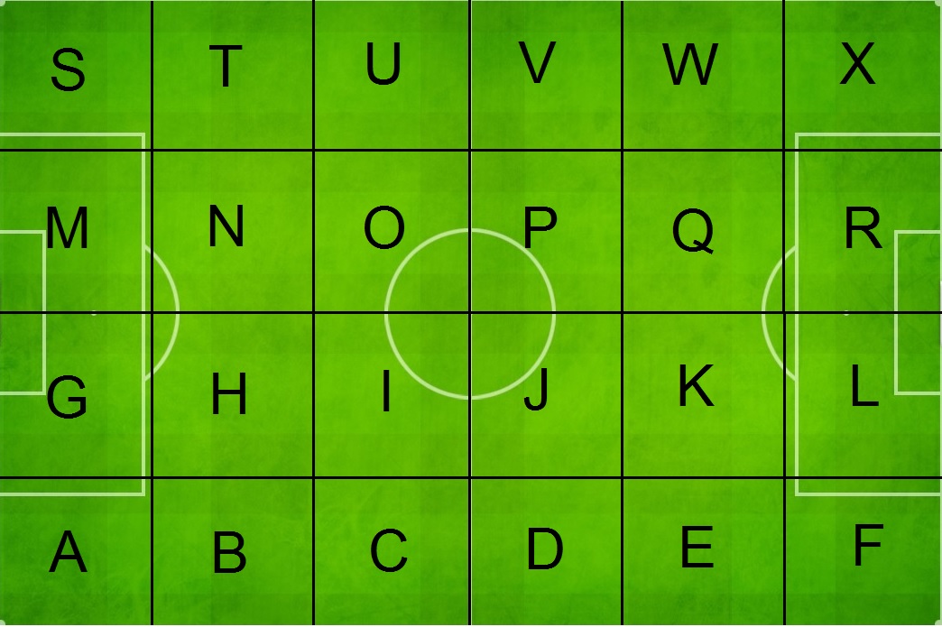
For my example, I decided to split the pitch into 24 equal size rectangles (grid sections). I have chosen 24 grid sections to try to have a large enough sub-sample in each section. Using the standard pitch dimensions of 106 by 68 metres, each grid section is approximately 18.2 by 17 metres in size. An example of how the grid is sectioned and their naming conventions can be seen below.
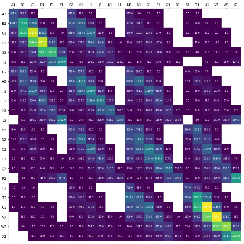
The next step was to then calculate the number of passes that originate in each of the grid sections seen above to all other grid sections. The picture below shows a heatmap from Python with the total amount of passes originating in ‘Y1’ to ‘Z2’, where the value of ‘Y’ is any letter along the top and the value of ‘Z’ is any letter along the side. You can see that the most common pass between grid sections was within the same grid section, from U1 to U2. Even with a sample of 176,049 passes, there are some pass routes which have no passes between them. These are indicated by a white square.
From here, I have calculated the number of passes which were completed and divided this by the total amount attempted between each grid section. This percentage is the expected probability of a pass to be completed between each grid section. In the heatmap below, however, it is clear there is a problem. Firstly, as mentioned previously, there are pass routes where there are no passes recorded between grid sections. Additionally, some pass routes have small sample sizes of either 1 or 2 passes - these percentages are therefore not reliable. This can be seen by the large quantity of probability 1 in the heatmap below.
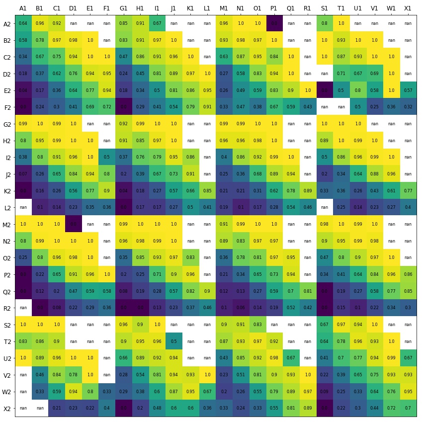
I did anticipate this would be the case given my sample sizes and knowing that certain pass routes would be rare. Therefore, in this project I have only used pass routes where the sample size is greater than 20 (e.g. R. Starr, P. McCartney and J Lennon). I am therefore confident in the reliability of the estimates in the project.
We can now use the average percentage completion calculated above to evaluate if our players performed better or worse than the sample average. In the visualisation below, I have also added a filter for pass difficulty and I have grouped passes into three categories:
‘A’ = pass completion average below 50% (difficult passes)
‘B’ = pass completion average between 50%-80% (medium difficulty)
‘C’ = pass completion average above 80% (easier passes)
We can now filter the visualisation below to look at the difficulty of passes J. Lennon and P. McCartney have performed and whether or not they were successful.
By using the filter to select both Medium and Hard difficulty passes, you can see that P. McCartney has performed and completed a larger number of difficult passes than J. Lennon, despite having an overall lower number of attempted passes. This indicates that the standard of difficulty of P. McCartney’s passes may be higher than J. Lennon’s.
A more thorough way to look at how each player performed is by looking at the table below. The table shows the same splits of pass difficulty (e.g. ‘A’, ‘B’ and ‘C’) but also shows the expected number of passes completed and how many they did complete. If the amount of completed is higher than the expected, then the player has outperformed the average.
From this we can see that both players underperformed in category ‘C’ passes. P. McCartney, however, over performed in the more difficult ‘A’ and ‘B’ passes. Therefore, his overall total exceeds the expected amount with him completing 30 passes versus the expected amount of 28.23. In contrast, J. Lennon’s performance was not so good, with him only completing 37 passes when the expected amount was 40.18.
This shows that pass completion (%) can certainly be misleading. Using the data in the table, I’ve calculated that J. Lennon’s pass completion (%) for the match should have been 89% but he only managed 82%. On the other hand, P. McCartney’s pass completion (%) should have been 76% but his performance was in fact 81%. This really emphasises that pass completion (%) can be easily manipulated by the type of player and the difficulty of passes they are performing. These results ultimately demonstrate that our initial thought of J. Lennon performing better due to having a higher pass completion (%) (82% > 81%) was wrong.
2.3 Improvements
Obviously there are some flaws in the example above, but the theory and how it can be applied to a larger sample is what is important here. With a large sample, there are many improvements which could be made. Firstly, the size of rectangle grids can be made more accurate e.g. the larger the sample, the smaller and more specific the rectangles grids can be. If we were to use a sample made up from multiple leagues, across multiple seasons, then you will be able to reduce the rectangles to be the same size as the ball, so every pass has a unique grid. This will lead to more reliable estimates.Another improvement which would be possible with a large sample size would be to incorporate important features in the model including: whether the pass was made on a players stronger or weaker foot, whether the pass was drilled, lofted, chipped, outside of the foot or made with the head. By adding these extra levels of detail, the estimates are more defined and ultimately the results are more accurate.
A further improvement that could be made would require tracking data. This is a state-of-the-art system that collects multiple samples every second. Tracking data provides the positions of every player on the pitch at any given moment in time. Using this, you could incorporate into the model the positions of a player’s teammates and perhaps more importantly, the opposition.
One interesting application of this, is that we may finally see an answer to the age-old question of ‘Did they play the right pass?’. If we have a model like the above (one which evaluates all the potential passes available and the corresponding probability of completing each of the passes) and if we combine this to a separate piece of analysis, one which has calculated the probability of scoring a goal given the new position on the field (for a completed pass), but also, the probability of conceding a goal given the opposition regaining possession at certain point on the field (for an incomplete pass).Then you have all the information you need in order to calculate a decision tree for every unique scenario. You can then mathematically answer the question, ‘Did they play the right pass?’.
This is undoubtedly complex, but if this system were to be created, this may provide information that could potentially change the way teams play football. By seeing the breakdown of the risk vs reward for each pass available, it could lead teams to change to new strategies in certain scenarios. It may hypothetically encourage teams to play riskier passes as the potential profitability is great or perhaps it may highlight the importance of keeping possession. Either way, it is something which could have a great impact on how the game is played and it is something I intend to look at in further detail in the future.
3. The true measure of a player's ability is how they perform in the big moments
Finally, I want to briefly mention how it can be advantageous to factor in ‘state of the game’ into a player pass map. This filter shows how a player’s performance changes depending on how the game is going.Players are human beings, and like every human being they follow patterns and can become predictable. By finding patterns in a player’s play, you can predict what players will do in certain states of the game. In the visualisation below, we revisit the pass map of R. Starr shown at the beginning of the project. This time, however, I have incorporated a filter for minutes of the match along the bottom and more importantly, I have included a ‘state of the game’ filter which focuses on what the score line was during the game. To provide some content to the example below, R. Starr’s team took the lead in the 22nd minute but were then pegged back in the 54th minute. They conceded again in the 80th minute and ended up losing the game 2-1.
By using the filter, you can see how R. Starr performed in each stage of the game. When his team were leading 1-0, his passes became a lot shorter and backwards (what would be classed as ‘C’ rated passes if we used the difficulty definitions discussed previously). Whereas after the 80th minute, when his team is losing, his passes become longer and more direct (passes which would be classed as ‘A’ difficulty).
This example is a one off but what if this pattern is repeated every time the team begins to chase the game with only 10 minutes to go? The team goes behind late on and R. Starr reverts to long ball football. Knowing this before the match, the opposing manager may instantly choose to bring on an extra centre back to deal with the threat of high balls towards the defensive line.
The example above is based on only one match, but the overall application is sizable. Imagine having the pass data from across a full season for every opposition player. This could be every pass they have made, with filters including: the minute of the match, the state of the game and the difficulty of the pass. You could build up a real picture of an opposition player and begin to know their respective strengths and weaknesses e.g. What areas of the pitch do they struggle to complete passes? Where do they look to pass the ball when they are being pressed (i.e. who you should be marking)? How do they perform in high pressure crucial moments? By knowing these details, you can be more prepared and construct scenarios to mitigate the opposition’s strengths and expose their weaknesses.
One other interesting aspect is combining the average pass completed calculated in Section 2, with a filter for the ‘state of the game’. The idea here is that you can look at how a player’s performance differs in different match situations. A player might outperform the expected passes when their team is comfortably winning 3-0 but perhaps the truest measure of a player’s ability is how a player performs in the most high-pressure situations (i.e. when needing a last-minute winner, or holding on to a slender lead). Players who continue to outperform against the average even in these crucial moments are truly impressive.
4. Conclusion
Evaluating player performance with any metric, especially using only one number, is difficult and pass completion (%) is no different. This project has shown its pitfalls but also presents the theory for an alternative method of analysis - one which looks at the quality of a pass and one which could quite easily be used by pundits and coaches alike. I also hypothesise about a system which could answer the question ‘did they play the right pass?’ and the implications about how this could change the game.This project also touches on how you can use filters to gain insights about a player and how you can investigate whether a player’s performance differs in different match situations. A player who continually outperforms the average in the most high-pressure situations is probably the true measure of a player’s ability.
The examples provided in the project are all in relation to 11 a side football, but the same theory can be applied to any match size e.g. 5 a side, 7 a side. With the amount of data available from a professional club’s training facility, you could build models with your own data from training matches and drills. By creating an average sample of performance, you can then compare everyday player training performance against the sample. Both coaches and players can look back at performances of that day and begin to track their metrics overtime and highlight where improvements could be made. This method of analysis could also be used to provide an added level of accountability for players in training.